Attribution / Licensing

Thursday, December 18, 2014

Christmas: A New Hope ???

Or, you know, whatever. All-around-great-guy Lar de Souza provided the line art and I just coloured it in.

A generic, ordinary..not that wookies are ordinary for Christmas... but average colouring.


And a little something different...


.. and a minor variant to that something different.

Friday, December 12, 2014

Poseidon & Pirates

This is a blending of two of the Sketch_Dailies twitter topics: the pirate Anne Bonny and Poseidon.  I figured the Greek God of the Sea might not be too keen on pirates causing wrecks and dumping corpses into his domain without his express consent.


Water effects are fun to play with, but can difficult to get right in a convincing manner.

Friday, December 5, 2014

Try something new

I usually like trying new things, especially if it'll let me expand my skills and hone or stretch my abilities.

So for this, I wanted to kind of reverse my normal method.
A sketch layer, a shade layer, and everything else on one layer. Line-art in the colour of the item. Fill it in a slightly different shade of same colour.

Not a terrible re-imagining for Sketch_Dailies' topic of The Riddler, but if you figure he's wearing a bald-cap, and a wig on top of it... plus the eye-mask, well, maybe that ain't too bad. Most of the redesign went into the trade-mark ?-cane.  A bit more short-blade sickle, and I figured hey, green & purple, a lot of weapons nowadays have circles punched through them for weight balancing and what-not, why not do that, but fill'em with the other costume colour ? I think I spent 2 hours start to finish, with a lot of revision in the sketch phase.


While most of the picture could burn, I am really please with how Edward's shoes came out.

Sunday, November 9, 2014

Tuesday, October 28, 2014

Inktober & Sketch Dailies [2014]

Instead of the usual digital-ink, I decided to bust out my watercolour postcards and copic markers that I've got stashed in a box with other physical art supplies [as opposed to ethereal, digital ones]. If you're wondering, I buy the majority of my stuff from Curry's Art Supplies.  They usually carry whatever I'm looking for, and at a better price than most of the other local shops.

The other local shops are okay and all, don't get me wrong - but there's some weird cool-guy / hipster / artsy-fartsy kinda vibe I get from them... like if you don't have permanent, expensive-brand grease-paint stains under your fingernails or in your horribly-high-schoolish mustache, you're not a "real artist" kinda vibe / impression. And I don't know about you, but I don't care about my `struggling artist / hipster / cool guy` street cred or whatever.. if I've got the choice of the same item at two different prices? I'm going with the cheaper price because hey, life is expensive enough!

I'd started to sketch this out in my sketchbook, and my brain kept telling me it was from some videogame I'd played when I was a kid, but I couldn't remember what game, even though Ogre Battle for the SNES kept coming to mind, but the style is all wrong and the pumpkin-head critters from that game are more scarecrow-jack-o-lanterns than this thing.

Yes, this is actual postcard that I've made, signed & dated on the back.


Friday, September 12, 2014

More Sketch Dailies

I've not been doing any Sketch Dailies daily topics on twitter.  Instead, I've been making conglomerations and amalgamation-type imagery.

Below is one:  Covers the topics of Dick Tracy, Casper the Friendly Ghost, Space Invaders and Gaston from Beauty & the Beast.


I like digital painting, and want to spend more time on it - but I'm impatient and often don't allow myself the time to do it up proper, and just whip something [like this] off quickly.

Monday, August 11, 2014

Tattoo design - from text to doodle to digital

A friend of mine on twitter had mentioned wanting a tattoo, and had something in mind but couldn't quite get what was in her head into the world, so I offered to design a little something-something for her.

So I quick whipped off a design on some paper with my very limited palette of Copic markers. This was done on a sticky-note style pad of paper. Same general size and all that, it just wasn't sticky, so a non-sticky sticky-note, right?


Not exactly what my friend was looking for, but she liked it - said it was a spin on the design she hadn't considered before. I'll take that as a compliment. Below is the digital version.


If you're unfamiliar with the character, it's a representation of Richard the Undead Warlock from the webcomic Looking For Group [LFG for short] by Ryan Sohmer & Lar deSouza of   Blind Ferret Entertainment.

Thursday, July 31, 2014

Retouching old works

Sometimes, some things that were created years ago should be left alone, for a semi-current example, the Star Wars movies [Episodes 4, 5 & 6] are ones the many people got upset over when George Lucas went back and tinkered with them.

And there's nothing wrong with tinkering with older works, to want to improve them.
But sometimes, one can tinker too much, or the current technology\ability  / skills doesn't mesh well with the older style.

I've been going through some of my works lately, and wondering what I could redo, touch-up or what I should just leave alone. The Death Beckoning I should have left alone, and when I went to redo it, I was happier with the original.

With this, the Alseid, a woodland nymph of mythology who lured men into the forests to devour them, souls and all, I originally tried a few techniques that seemed to have worked.  Yet I was never really satisfied with it - I like it enough I'm planning on making a print of it, but I thought I'd try touching up a few spots that always drew my eye to and I wanted to fix.

So here's the original, with the touched-up version below.


Saturday, July 12, 2014

Old and New with a touch of advice

I painted this a few years ago:


And I painted this last night.


As an artist, it's easy to look back at previous works and want to improve something. And sometimes, in the trying, you recognize that it doesn't need to be improved and is fine just as it is. ...and sometimes when you try to improve on something that's fine as it is... the results are less than satisfactory.

Art is art is art - and sometimes, as an artist, you gotta just like your own work, slit that inner-critic's throat to silence it long enough to like your own art.

Monday, July 7, 2014

End of Class - Spider-Girl

It's the end of the six-week Comic Experience: Intro to Digital Painting Course.

And I gotta say, it's a lot different from the Intro to Comic Colouring Course.

It seems similar - and it 
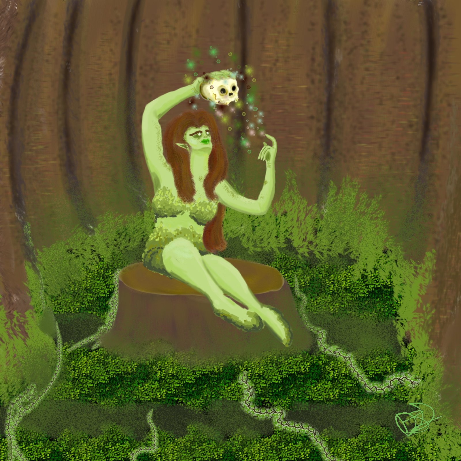
is similar, colour theory, highlights and shadows - but when you get down to work, it's a different beast altogether. As was discussed in class, when colouring an inked piece, the shadows and blackest parts are already in place. But for painting, you go as dark as you want / can, because there is no 'darkest point' laid out for you.

Once again, a Comic Experience course that doesn't disappoint and is worth the money.
I know what you're saying / thining - that's a lot of money for a once-a-week, 6-week course.
Yeah, they're pricey, but they're also small class sizes, so you get more time to go over your work and see where you can improve - and what you've been doing well. The homework is often as enjoyable as it is challenging, and it's also stuff that you may recognize if you've been cognizant of media over the last 5 or 6 years.  Wait, Spider-Man [tobey macguire version]came out in 2002? Okay, so the last 10 years. 10 years? Ouch and wow, comic stuff has been in the mainstream media for a while now.


Anyhow, I did all this in RGB..and when it converts to CYMK, it looks like chalk art [light, not quite pastel-ish colour].  I learned a few things - important [for me] things and hopefully I'll remember them.

I need to re-tweak my tablet-monitor's colours/contrast/gamma, as what looked nice and dark came out not so much. But that's kind of the point of a class - learn things!! And in a Comic Experience course, you learn all sorts of good stuff.

Sunday, June 29, 2014

Gold Iron-Man helmet

Working with lighting - absorption, refraction, reflection - on metals.
Gold is... interesting. It absorbs light, but reflects more than enough to be able to have a mirror-esque finish. Soft and malleable, easily dulled and dented, but capable of a fine shine.

These may look "okay" at a casual glance, and maybe I'm my own worst critique
[no internet, that is not a challenge], but there's something about these that doesn't feel right to me, and I'm not sure what. Going to try and get one more attempt done before class tomorrow, maybe finally nail it down.

This is shading with colours, instead of lightening or darkening an already coloured section.


And this is using the lighten / shadow brush in MS5.  The shadow brush takes a really light touch to us it without 'burning' the colour.


Update:

A 3rd attempt - about 50% done, ran out of time before class [and dinner].  I like this one much better, but it's still not where I want it to be [but I think I may have found some brushes that'll get me closer to it]


]EDIT[

Here's the 3rd attempt - finished.


Sunday, June 22, 2014

Skullkickers colours

Via the wonder of twitter, I saw a link from Jim Zub to some line art for his fun-to-read comic SkullKickers.

So I snagged the made-available [here] line art and spent some [very distracted] time doing this to it:


And in case you're wondering, oh yeah, I borked the booboojeebies out of this.
My light sources are wrong, my shading went off the rails.
This is not quality work. This makes me mad at myself. I need to do this again and do it right.

Here's my flats - no major issues with them, but I completely demolished the highlights, shadows, lighting, contours and depth.


Friday, June 20, 2014

Mjolnir Homework for ComicExperience

So, this is my homework for the Intro to Digital Painting course taught by the amazing Scott Johnson.

Not familiar with his work? Google-image "Palladium books" or "Rifts RPG" He painted up some of those covers, notably the shiny armour ones.

Anyhow.. homework was to pain Mjolnir.  I managed to squeeze this out in the 3 & 1/2 hours I was listening to Lar de Souza's ustream. Done in Manga Studio 5 with a variety of brushes.


It was supposed to just be the hammer - painting planes and angles without lineart, but I couldn't help but add some effects.

Here's Mjolnir without the effects.

Sunday, June 1, 2014

A Mustachioed Menace

I blame/thank Paul Tobin for the idea:

What if: Galactus had a mustache?

After some google-image searching, I've come to the conclusion that Galactus' helmet has a few commonalities, and a lot of other decorative stuff that's up to the artists' discretion. So I kept it pretty simple for this, though I do want to spend some time just going to town on it [the helmet] in the future. 


I know the Avenger's movie franchise is taking aim at Thanos... and I [personally] would love to see a bit of "here's how bad/powerful our villain is" with an opening scene/credits bit of Thanos knocking Galactus around.  He's done it in the comics, let's see him do it on the big screen before the Avengers come to save us all.

And then, of course, because I can - I made Paul Tobin a World Devourer:


Made a few changes to help balance the photo over/under the drawn aspects.
I like the eyes & cosmic eye-...smoke? leaking power? whatever? in this more than the first. 

Wednesday, May 21, 2014

Spider-Man Coloured

And here's the coloured version.


The clouds were giving me some grief until I remembered a few things.
I think I prefer an instruction of "please add clouds" to a colourist instead of the artist drawing them in, as this can produce a more natural kind of cloud formation. But that's my opinion.

Spider-Man flats

I was making some decent time on flatting this and the day got away from me. Phone calls, laundry, errands... and now here I am, 12 hours later, finishing *just* the flats.

And that's fine - for now. Because it's not a job, I'm not paid to do this. [yet]


Normally I'd leave colouring effects - especially text effects, until last, but I was curious if my initial idea for the 'thwak' would balance or further unbalance all that sky.

Sunday, April 20, 2014

"Old School" mash-up

Inspiration strikes in the shower, right?
That's the cliche`, anyhow. I figure it's more that you're focused on a mundane task, and your brain is free to wander - without the usual forced-to-wander kind of creative thing going on. Like a puppy let loose in a field, as opposed to a fenced-in park.

I had a fleeting thought about that Muppets art collaboration thing [that I didn't get in on], and then soap in my eye, and then this is what hit me in the shower.


Friday, April 18, 2014

Fantastic Four page - coloured

Aaand here's the flats all coloured up.


Initially saved as a 17meg+ jpg, I resized it down to about 130kb. Gotta love Irfanview.

So the costumes are different from the norm, or any of the redesigns I'm aware of [all-white with some black, and red & black].  I think it works okay - not great or amazing, but it works okay.

The Thing is often orange-y/brown..supposed to be all rock-like. So I spatter-flecked him out with some lighter & darker shades ...pondered trying some marble-style vein/slash designs but it just didn't look good.

Johnny's almost always on fire.. so that's half the team being red[ish] / hot coloured.... and they also tend to be the hot-heads. [moreso Johnny than Ben].

Sue and Reed are the scientists of the team.. so I kept their costumes similar to help balance against the reds/oranges.  Sue's a biologist if I remember right, and would know the value of letting your skin breathe. Yeah, Reed designed the costumes out of ...unstable molecules?... so I'm sure it breathes better than cotton, but nothing breathes as easy as no impediments at all.

Anyhow.. team balance, brains & brawn.. blues and reds.

Fantastic Four page

I don't know about you, but FF means Final Fantasy to me.. probably because I've never been a fan of the Fantastic Four.

There's no script with this bunch of assorted Marvel pages, so I'm just winging it here, feeling a bit adventurous. Also playing with a lot of blue here.

Work in progress - flats.


Sunday, April 6, 2014

Something old, Something new

So I bought a few more brushes that Ray Frenden's created. I have a hard time understanding how artists and colourists - any creative individual, really - are still working in Photoshop.  Manga Studio is a much more natural art program to work - a better ability to replicate real-world brushes and set up pages and such for printing in an easy-to-see / understand method.

Why am I so pro-Manga Studio? is it because Adobe screwed me out of my investment into their Creative Suite 3? No. ...I am still sore about that, coming on almost 7 years now.  But it's the fact that this is a program designed for people who draw, who create... whereas Photoshop's options often seemed like they were jammed in as afterthoughts or half-hearted appeasements.

Back to the point: I got playing with Frenden's Wash Brushes.. and figured what better subject than to remake an old Fallout Super-Mutant quick sketch I did a few years back. For those not familiar, the Fallout World is post-nuclear-apocalypse.  Think the version of the future envisioned by 1950s/60s sci-fi and fantasy.

But with no running water, and most of the water being radioactive, you can imagine the layers of grime one would accumulate whilst traipsing about the new-but-broken world.

Remember now - this is a recreation, not just colouring old lines, so there'll be some differences.

Original:


Tuesday, March 25, 2014

Tinkering with AnimeStudio

So, after messing around with some Anime Studio [Pro 9], and some yapping back&forth on twitter with the always great Lar de Souza, there was a mention[my fault entirely] of Bacon Shark.

With the Octo-shark Vs. Vegemite Girl and Sharktopus and Shark-valanche and Sharknado and Shark-in-your-eye and all the other aspiring B-movies... hellllllllo BaconShark.

Music scored by John Williams and performed by The John Williams Orchestra.

And yeah.. animating water coherently and believably is kind of a pain!

So here's an hour's worth of goofing around in AnimeStudio.
Exported to AVI, then converted to MP4 in Any Video Converter. Dropped from a 110mb file to 11mb file.


Okay, so after watching it here... WOW... issues!
There was loss of layer order...and some animation I never did [like the shark turning in the middle of the stage].  I also have no idea why the water & sky keep changing colour.. they were supposed to fade to black in the last 10 frames of animation. Issues, issues. Stuff to figure out.

So, obviously, converting the file may have done something, like losing frames, or I may have exported it incorrectly or something.

Still.. for only going on what I can figure out with the program, not too bad...
but definitely not good. Think I'll stick with the drawing and colouring thing for now until I can beef-up my chops with this program.

Monday, March 24, 2014

Pneumonia Pno More!

So this cough I'd been fighting since Christmas turns out to have actually been pneumonia.
Got some meds and am now kicking Pneumonia right in the silent-P.
One side effect is they make me dizzy.  Another is supposed to be hallucinations. So I'm really hoping all that talk about a new tv series about an animated Brids of Prey where I get to voice a couple of villains if true.
Which it isn't, because I just made that up.

Something else I've just made up is this piece here.
The always awesome Lar deSouza had tweeted something about wanting to see other artist's old works, to see how far they've come in their abilities and craft. I don't have any paper&pen sketches anymore of these guys, but figure it couldn't hurt to re-create them digitially.
Well, I've been drawing these two since I was 8 years old.  Sadly, I cannot recall the name of the "hero", but the "villain" has always been Hornible.
And if we're honest.. what can be more villainous than putting ice in someone's drink while they're off to the loo? Well, lots of things, really. But it's never the big things.. but a piled-on heaping helping of small things breaks people..especially heroes, right?


Done in Manga Studio 5 with Ray Frenden's brushes. You can pick up all of Ray's brush packs for something like $20 - completely worth it.

Tuesday, March 4, 2014

Colouring the Lartist

The always-a-great-guy Lar de Souza was kind enough to send me his line art & inks for a piece he's doing for a convention or some such thing - you can check out his own colours and such HERE.

I had no idea what colour scheme he would be using for anything, an didn't want to see his finished piece before I made solid commitments to my own colour schemes.  Thankfully, I only saw his after I'd already laid out my flats.

My only complaint is the line art & inks he sent weren't signed by him. I believe in giving credit where it is due, and this wouldn't have happened at all if not for his art.

So here's my colours on his awesome art:

First the flats:


And now the finished piece:


Thursday, February 6, 2014

Character Design Version 2

Trying a different shading/colouring technique that, in my own opinion, I need more practice on.
I don't know the proper name for it, I've always referred to it as two-tone shading, or "Simpson's Shading".


Tuesday, February 4, 2014

Character design, Version One

Version One of a character design for a set of short stories that are brewing. 

There's a few other styles to try out before I settle on one. 


Friday, January 24, 2014

Quick sketch & colour

Whenever I doodle for myself, I almost always shortchange myself and run out of room for the feet. Makes me worry a little bit.

Anyhow, here's a gunslinger with some simple wash colour and even simpler gradient background.


Friday, January 17, 2014

King's Watch - Marc Laming art

So a snap of Flash Gordon and Mandrake the Magician going off-roading through some weird alien-esque critter was flopped around Twitter.

I like it! So.. despite the low-res availability,  and after some fiddle-farting around with my browser and Instagram, I managed to get the pic[and permissions] and coloured it in.


From what little I've seen / read of King's Watch, it's pretty good entertainment!
Knowing almost nothing about any of the characters, aside from the 70s?80s? Flash Gordon movie [mostly the Queen theme song] and the ..mid/late 90s? The Phantom movie, I like seeing these guys getting together and doing awesome things.  Jeff Parker and Marc Laming have a good series here.

Part of me visualizes the art credits as being emblazoned like raised ornaments...leaving an imprint on the robo-alien-thing's chassis\chest. And that makes me laugh. ^_^

Thursday, January 16, 2014

Batman '66

So, via Greg Pak, by way of Brian Michael Bendis with a source of Alex Chung through the magic of Tumblr, I come across a black and white image of this awesomeness.  Classic 1966 Batman and villains as drawn by Kevin Maguire.

And it's just one of those things I had to colour. From memory, despite the fact the show is/was before my time, but reruns let everything live forever, more or less.

So.. some classic campy Batman, drawn by Kevin Maguire, coloured by me:


My only real concern doing this from memory is the Egg Master [Egg Man?..bald guy by the Joker, played by Vincent Price if I remember right], and the two top-corner villains, along with the prison-striped faceless guy behind the Mad Hatter.

And just because.. I even colour-doodled in Cesar Romero's white-painted mustache on the Joker.

Trying to think of the actors behind the costumes...  Adam West, Burt Ward, Cesar Romero, Frank Gorshin, Julie Newmar \ Ertha Kitt, Vincent Price, Burgess Meredith, ... I can't remember who played King Tut, Mr. Freeze or the Mad Hatter.


Sunday, January 5, 2014

Abominable Charles Christopher / Karl Kerschel contest

Karl Kerschel, creator of the entertaining The Abominable Charles Christopher webcomic has a colouring contest going on.

So I tried my hand at it.
I'm never a fan of contests that don't have easily identifiable rules for what would make a winning entry, but then again, this is art, which is always subjective. So there I go.

Here's my colouring over his lineart :


It's been submitted to the facebook page.  I'm not looking so much to win the contest [which hey, would be nice, don't get me wrong], so much as I'm pushing myself to submit things that aren't perfect in my own eyes, because none of my work will ever be perfect to me. I can almost always see something, look back at works, that could be improved. 

Wednesday, January 1, 2014

Goodbye 2013, Hello 2014

Normally I don't generally care, or celebrate things like the New Year... really, I mean, if not for certain Roman Caesars wanting to be immortal, we'd still have a 10-month calendar.  So it seems to me that the celebrating the change-over of one day into another because of the end of a numerically dated sheetbook seems kind of silly... but hey, any excuse for a booze-up, right? That's what people want, it seems.

so.. last sketch of 2013, first of 2014.. because hey, we have to mark these things down and take note, right? Right. Though a lot of days I wonder why.